Introduction
I have been an occasional student of fonts ever since 2010 when I designed a font for an organisation. I have also watched with interest fonts aimed at dyslexic people. All these fonts are aimed at improving the visual readability of “printed” text, and we have come to take for granted the efforts of font designers. To put their efforts into some relief, I thought to make a font that sets out to be very difficult to read.
Some Design Ideas
We have grown used to having a number of features common to any particular family of fonts. For example,
- curves are common
- the visual bulk of lower case letters tends to avoid the top edge
- upper case letter usually have a stronger presence on the top edge
- each occurrence of a letter looks exactly the same every time
The task was to design a font that turned as many of these features as possible on their head.
The Result
The result was built around using straight lines that went from point to point on a rectangular matrix. The lines themselves came in two different thicknesses. The thickness of each line was chosen at random. The result looked like this: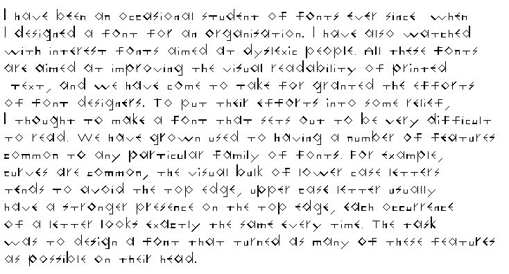 People of a masochistic nature will notice that the text in the image above are the words at the start of this post.
Enough of this foolishness. 🙂